UX Research, UX/UI Design, UX Writing
Airline Flight Booking: From Research to Prototype
Designing a frictionless flight booking journey through deep user research, competitive benchmarking, and iterative prototyping to bridge the gap between traveler needs and business goals.

1. Project Overview
This project was developed as the final case study for my Professional Diploma in UX Design. Following a specific brief, I was challenged to design a flight booking website for Wunderlust, a startup airline. The goal was to create an end-to-end booking experience that addressed common industry friction points while meeting academic and technical requirements.
-
Role: End-to-end UX Designer
-
Context: UX Design Institute Diploma Project
-
Outcome: Transformed the complex airline funnel into an intuitive experience through strategic content hierarchy and inline editing, directly addressing the primary causes of cart abandonment.
2. The Challenge
Current airline interfaces often suffer from "dark patterns," cluttered layouts, and rigid flows that punish user errors. The brief required a solution that felt fast, reliable, and transparent, allowing users to book flights without cognitive overload.
The Core Conflict: How to balance business goals (upselling and data collection) with a user’s need for a simple, non-linear booking experience?
3. Objetives and Goals
The primary objective of this project was to design a high-converting, user-centered booking platform. My approach was deeply rooted in Jakob’s Law, ensuring the interface aligned with existing mental models and industry standards to reduce learning curves and friction.
By prioritizing consistency and standards, I redesigned the flow to meet user expectations while solving specific usability gaps identified during my research.
-
Align with User Mental Models: Apply established UI patterns from the travel industry to ensure the booking process feels intuitive and familiar from the first click.
-
Reduce Friction in the Booking Funnel: Streamline the path from flight search to payment, minimizing the steps and cognitive load required for completion.
-
Implement Error-Resistant Design: Develop a linear flow that allows users to edit information (dates, passengers, seats) without losing progress or restarting the journey.
4. Design Process (User Centered Design)
I followed a user-centered design (UCD) methodology, moving from an in-depth research and analysis phase into iterative design and prototyping. Every solution was validated through usability testing to ensure it met user needs before final hand-off and delivery.
-
Research: Conducted competitive benchmarking, user interviews, and surveys to map mental models and identify industry-standard friction points in the booking funnel.
-
Analysis: Used Affinity Diagramming and Customer Journey Mapping to synthesize data and define the core pain points.
-
Design: Iterated from low-fidelity sketches to a high-fidelity interactive prototype in Figma, focusing on Information Architecture.
-
Validation: Conducted moderated usability testing with 8 participants to validate the flow.

5. Research & Analysis
My approach started with an intensive investigation into the user's mental model when booking flights. By placing the user at the center of the discovery phase, I was able to identify that the biggest pain point wasn't just the "look" of airline sites, but the rigid logic behind them.
Research Methods:
-
User Survey: Conducted with a target group of 10 participants (as assigned by the Professional Diploma requirements) to quantify booking habits. Data revealed that 80% of respondents prefer desktop for final bookings due to the complexity of flight forms.
-
User Interviews & Surveys: Conducted research with 8 participants to uncover emotional triggers and functional barriers. I discovered that anxiety levels increased during the final stages of the booking due to the fear of inputting incorrect data.
-
Competitive Benchmarking: Evaluated industry leaders to understand established patterns, ensuring the new design would follow Jakob’s Law while improving upon identified navigation flaws.
Quantitative Insights (Survey)
I launched a targeted survey to understand app usage motivations.
-
Sample Size: 10 respondents (Meeting the requirement of 10).
-
Constraints: While I recognize the sample size is limited for broad statistical significance, it provided crucial qualitative directions within the project's tight timeframe.
Competitive Benchmarking
Evaluated industry leaders to understand established patterns (Jakob’s Law) while identifying navigation flaws to improve upon.
User Interviews & Key Questions
Which device do you typically use to complete a flight booking? And why?
Have you ever abandoned a flight booking mid-way? If so, what was the primary reason?
On a scale of 1-5, how frustrated do you feel when you have to restart a booking process because of a typo in your personal information?
When selecting a fare (Basic vs. Premium), what information is most important for you to see clearly to make a quick decision?


5.1 Key Research Insights
Translating user pain points into strategic design opportunities.
"When buying the ticket, there are many steps and things to select on different pages that you have to click "next" and load a new page over and over again, it would be easier to have everything on the same page"
""Should be easier to change dates to check prices without having to restart the entire process""
"More intuitive and less annoying offers (for example, renting a car to the place you are going to visit) while you are doing the booking of your flights which are confusing when they could offer it before finish the purchase"
1. Desktop-First Mental Model
-
Insight: Users perceive flight booking as a high-stakes task that requires maximum visibility and control.
-
User Evidence: 80% of participants (8/10) explicitly prefer using a computer or laptop over mobile devices for completing airline reservations.
-
Design Opportunity: Prioritize a robust desktop interface that utilizes the wider screen real estate to provide a persistent booking summary, reducing the cognitive load of switching between screens.
02. The Price & Transparency Driver
-
Insight: Price is the primary motivator, but the lack of clarity during fare selection creates a "trust gap" that leads to abandonment.
-
User Evidence: 60% of users are motivated by prices and offers, yet 40% struggle when they cannot easily compare cost versus schedule (time/day).
-
Design Opportunity: Apply Content Strategy and information chunking to create a side-by-side comparison of flight tiers, ensuring the "final price" is always transparent and visible during the selection.
03. Competitive Context & Familiarity
-
Insight: Users carry heavy expectations based on their frequent use of low-cost carriers (mental models are set by specific market leaders).
-
User Evidence: 60% of users visited an airline site in the last 4 weeks, with Ryanair (30%) and Aer Lingus (20%) being the most cited reference points.
-
Design Opportunity: Lean into Jakob’s Law by adopting familiar UI patterns for the search and seat selection, while innovating on the error-recovery flow (the biggest pain point identified in those competitors).
6. "How Might We" Questions ( HMW)
-
How might we empower users to navigate the booking funnel non-linearly, giving them the freedom to jump between steps as their priorities change?
-
How might we streamline the data entry process to minimize the time spent on repetitive forms, making the journey feel faster and more intuitive?
-
How might we design a flight booking experience that feels flexible and transparent, allowing users to correct errors seamlessly without losing their progress?
-
How might we balance business upselling with user experience, ensuring that additional services are easy to compare and don't create cognitive friction?
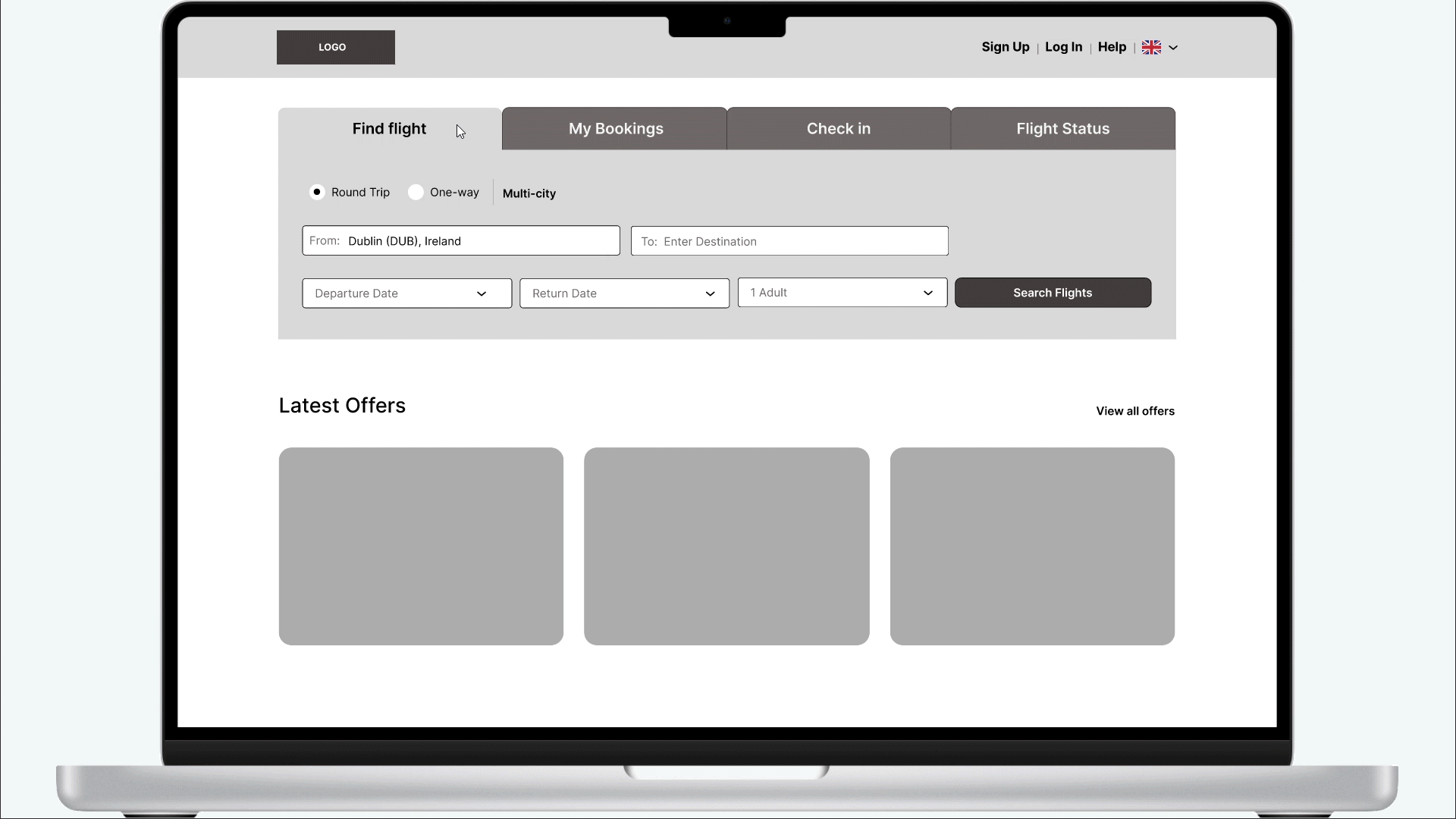
7. Sketches
At this stage, I mapped out the core booking flow through rapid sketching and iteration. By applying industry standards and addressing the primary pain points from my research, I finalized a set of seven screens. This foundation ensured that the transition from flight search to checkout felt logical, minimizing cognitive load before moving into high-fidelity design

8. Interation & Refinement
Using Figma, I developed a comprehensive medium-fidelity prototype to validate the Wunderlust booking journey. The focus was on architectural integrity—ensuring that layout, spacing, and visual hierarchy guided the user intuitively. By prioritizing design conventions and user mental models at this stage, I was able to test not just the flow, but the clarity of the information, ensuring the Figma prototype felt like a reliable reflection of the final product before moving into high-fidelity


Final Reflections & Learnings
This project was a defining milestone in my journey as a designer, completed two years ago as the final case study for my Professional Diploma in UX Design. Looking back with my current expertise, I see it as a strong foundation in User-Centered Design that I would now elevate with more complex methodologies.
What I would do differently today:
1. Data-Driven Research at Scale: For a real-world airline, I would expand my research to include Quantitative methods like A/B Testing on pricing displays and Heatmap Analysis to pinpoint exactly where users drop off in the funnel. I would also utilize Qualitative Diary Studies to map the traveler’s entire journey.
2. Strategic Collaboration: Working as a solo designer on this project, I realized the importance of Cross-functional Brainstorming. Today, I would seek to collaborate with UX peers and stakeholders through Design Sprints to challenge my assumptions and co-create more innovative solutions for complex edge cases.
3. Deepening the Findings: I would conduct a deep dive into why users still feel more confident booking on a laptop. By investigating the mobile user journey through Contextual Inquiry, I would seek to identify and bridge the specific trust and usability gaps that prevent users from completing high-stakes transactions on mobile devices.
4. Final Thought: The Wunderlust project taught me that designing for airlines is a delicate balance between business profitability and user sanity. It remains a testament to my commitment to clarity, error prevention, and Content Strategy.